If you visit the React documentation for Uncontrolled Components you will be greeted by header text telling you that controlled components are the current recommended default. It also tells you that you will need a ref to get the value out of an uncontrolled input and links to a blog saying essentially the same thing. If this was your introduction to the tradeoffs of using controlled vs uncontrolled inputs you would understandably avoid uncontrolled inputs in your forms. This would be doubly true after reading the React docs saying this about when you might use uncontrolled inputs:
It can also be slightly less code if you want to be quick and dirty.
A resounding endorsement in my book. However, I think this is worth a more careful look and this post is going to go into more depth on the value of uncontrolled inputs.
I'm going to assume you already know React. All of my examples will be in Typescript with Material UI although I'll keep the MUI specific content to a minimum in this post. Mostly it's just nice to have JSS around so I can have the styling in the same files for the examples.
A Basic Form
With a controlled input some React component needs to track the state of all inputs in component state. Using uncontrolled components, we can let the DOM do all that work for us. HTML forms are designed for this, why not leverage the tools the browser provides?
I'll be working with a file called Form.tsx. We'll keep adding to it as we go through the examples and build it up. The complete files are available in this gist.
import React, { useCallback } from "react";
import { makeStyles } from "@material-ui/core";

// Just some basic styling to keep the form flowing top to bottom
// with a little spacing.
const useStyles = makeStyles((theme) => ({
  validatedForm: {
    "& label": {
      display: "block",
      marginBottom: theme.spacing(2),
      "& > span": {
        marginRight: theme.spacing(1),
      }
    }
  }
}));

export const Form = () => {
  // The submit handler, you might not even actually need this if you just want to
  // POST form data to your server but I'm adding it to show how you could use it.
  const handleSubmit = useCallback((e: React.FormEvent) => {
    e.preventDefault();
    const formData = new FormData(e.target as HTMLFormElement);
    formData.forEach((val, key) => console.log(`${key} => ${val}`));
  }, []);
  const styles = useStyles();
  return (
    <div>
      <h1>Give me all your personal information</h1>
      <form onSubmit={handleSubmit} className={styles.validatedForm}>
        <label>
          <span>Legal Name</span>
          <input name="fullname" />
        </label>
        <label>
          <span>Date of Birth</span>
          <input type="date" name="dob" required />
        </label>
        <button type="submit">Submit</button>
      </form>
    </div>
  );
};
Try filling this out and hitting submit. In your console you should see something like:
fullname => John Smith
dob => 2022-06-10
If you don't access to input data as the user is typing, there is no need for a ref at all. When the form is submitted you can get access to it through
the FormData object. You can manipulate the form data here or add additional information and then
send it on to your server using fetch. You could of course just use the action and method attributes on the form and have no onSubmit handler at all but
I prefer to submit it manually so I can show a loading status on the page and display error messages inline if necessary.
If you have React developer tools installed, enable the Highlight updates when components render. option and start mashing buttons. You shouldn't see the form re-rendering. This is
another perk of not having to track form state in the component.
What about validation?
Validation is where I traditionally see people switching back to controlled inputs. They want to be able to show hints if an input is invalid and block form submission until it is ready. Fortunately, there are ergonomic ways to do this with forms natively and we'll explore some basic ones in this section.
Required fields automatically block form submission and you can use the :valid family of css pseudoclasses to apply styles or show hints around a form and inputs.
Required Fields
This is the easiest type of validation to perform. Just mark an input as required and try to submit the form without it.
<label>
  <span>Date of Birth</span>
  <input type="date" name="dob" required />
</label>
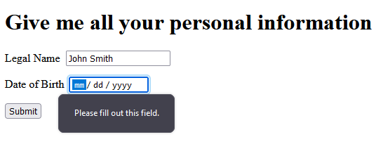
You should see something like the screenshot below. The onSubmit handler will not have fired.

User Feedback
Giving the user feedback as fill out the form can be done in a fairly straightforward way with the :valid and :invalid pseudo classes in css. Let's update the jss:
validatedForm: {
  // all the existing stuff ...
  "& *:invalid": {
    boxShadow: `0 0 5px 1px ${theme.palette.error.main}`,
  },
  "& *:focus:invalid": {
    boxShadow: "none",
  },
  "& *:valid ~ p": {
    display: "none",
  },
}
And update the form with some new elements:
<label>
  <span>Date of Birth</span>
  <input type="date" name="dob" required />
  <FormHelperText>Enter your date of birth</FormHelperText>
</label>
<label>
  <span>Tell us about yourself</span>
  <textarea minLength={20} maxLength={120} required />
  <FormHelperText>Use 20-120 characters to tell us about yourself</FormHelperText>
</label>
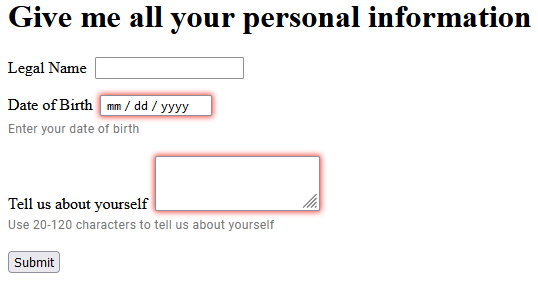
FormHelperText is just a fancy <p> tag. The css we added earlier will hide it when the hint when the input is valid. We also get red
shadows for invalid inputs that are hidden when the input is focused. You should now see something like this:

Check out the other HTML5 input types that are available here. You might be surprised by what is supported natively.
More Complex Example
So far we've stuck to validation that is supported directly by the browser. You are likely to come up against requirements for more complex groupings of
inputs that also require validation. For scenarios like this the constraint validation API is your friend. In this example we're going to use a grouping of checkboxes where at least one of them must be selected to submit the
form. We'll build this in a separate component, go ahead and create Checkboxes.tsx.
import React, { useRef } from "react";

interface Option {
  name: string;
  label: string;
}

// An interface for our props
interface CheckboxesProps {
  options: Option[];
}

export const Checkboxes: React.VFC<CheckboxesProps> = ({ options }) => {
  // Store a ref to a container element to make it easy to select the checkboxes
  const parentEl = useRef<HTMLFieldSetElement>(null);

  // Use that ref to grab all the checkboxes.
  const checkboxes = () => (parentEl.current?.querySelectorAll('input[type="checkbox"]') ?? []) as NodeListOf<HTMLInputElement>;

  // setCustomValidity with a non-empty string marks the element as invalid. The message will be shown if you try to submit the form
  const setAllInvalid = (nodes: NodeListOf<HTMLInputElement>) => {
    nodes.forEach(checkbox => checkbox.setCustomValidity("You must select at least one option"));
  }
  // setCustomValidity with an empty string marks the element as valid
  const setAllValid = (nodes: NodeListOf<HTMLInputElement>) => {
    nodes.forEach(checkbox => checkbox.setCustomValidity(""));
  }

  // When any checkbox changes, see if any are checked and set the validity
  const handleChange = () => {
    let anyChecked = false;
    const boxes = checkboxes();
    boxes.forEach(checkbox => anyChecked = anyChecked || checkbox.checked);
    anyChecked ? setAllValid(boxes) : setAllInvalid(boxes);
  }

  // Mark the inputs as invalid when the form initially renders.
  // Without this you would have to check and uncheck a box for the validation
  // to take effect.
  useEffect(() => {
    setAllInvalid(checkboxes())
  }, [])

  return (
    <fieldset ref={parentEl}>
      <legend>Select at least one</legend>
      {options.map((opt) => (
        <label key={opt.name}>
          <span>{opt.label}</span>
          <input type="checkbox" name={opt.name} onChange={handleChange}/>
        </label>
      ))}
    </fieldset>
  );
};
If you're looking at this and thinking this should be a <select multiple required>...</select> you're probably right. Ignore that feeling. Let's
bring this beast into our form. Import it:
import { Checkboxes } from "./Checkboxes";
Define some options:
const checkboxOptions = [
  {
    label: "I consent to receiving marketing communications",
    name: "consents",
  },
  {
    label: "I do not consent to opting out of marketing communications",
    name: "stillConsents",
  },
];
Stick it in the form:
<Checkboxes options={checkboxOptions} />
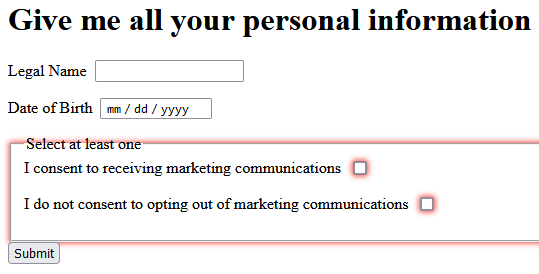
I removed the other required attributes and the textarea for this example, but you should now see something like this:

If you check one of the boxes the form will be valid and you can submit. If you try to submit with nothing checked you should
see a dialog like before with the "You must select at least one option" message over your checkboxes. You might also have noticed
that the fieldset has a red box shadow around it. Form and Fieldset tags can also be invalid. If you wanted to eliminate this
you could make those *:invalid selectors more specifc but I was being lazy and just wanted to highlight everything. You can leverage
this to display additional hints around the form or field sets that are invalid if you want to give broader hints or feedback to your users.
Alternative Implementations
You might end up having to use an input control from a third party library that has to be used in a controlled fashion. It might send asynchronous
requests or just not be designed with regular forms in mind. If something like this comes up, you can abstract this control away by making it a separate component
and using a <input type="hidden" name="whatever" /> to store the actual value. This separate component can be a normal controlled React component but the form doesn't need
to know that. As long as the hidden input has the expected name when the user clicks submit that data will be available.
Another alternative is to just make those elements controlled directly in your form component and inject the data into the FormData object in your onSubmit handler. If you
have a big form this can still save you a lot of work.